Adidas have created the Manchester United kits for the 2020/21 season with the aim of incorporating the tradition and values of the club along with modernity and innovation.
Manchester United 2020 Home Kit

The Manchester United home kit features a black and yellow strip graphic throughout and it has the base red colour that adds a mélange effect to the shirt.
The stripes on the shoulders, the Adidas logo and the sponsor logo have been designed in white.

The yarn stitch pattern continues in the shorts and the socks as well. The white shorts have the pattern on the sides and the black socks have a similar mélange effect to that of the shirt.
Manchester United 2020 Away Kit
Manchester United’s first-ever shirt under the name Newton Heath was green in colour and this season’s away kit takes inspiration from that.
Adidas describes the 20/21 away shirt colour as ‘legacy green’. The logos and the Adidas stripes are in off-white and there is a ‘legend earth green’ pattern than runs all over the shirt.
The away kit is completed with a set of shorts and socks featuring a darker shade of the colour as compared to the shirt.

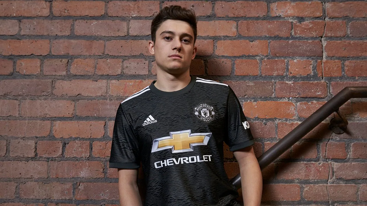
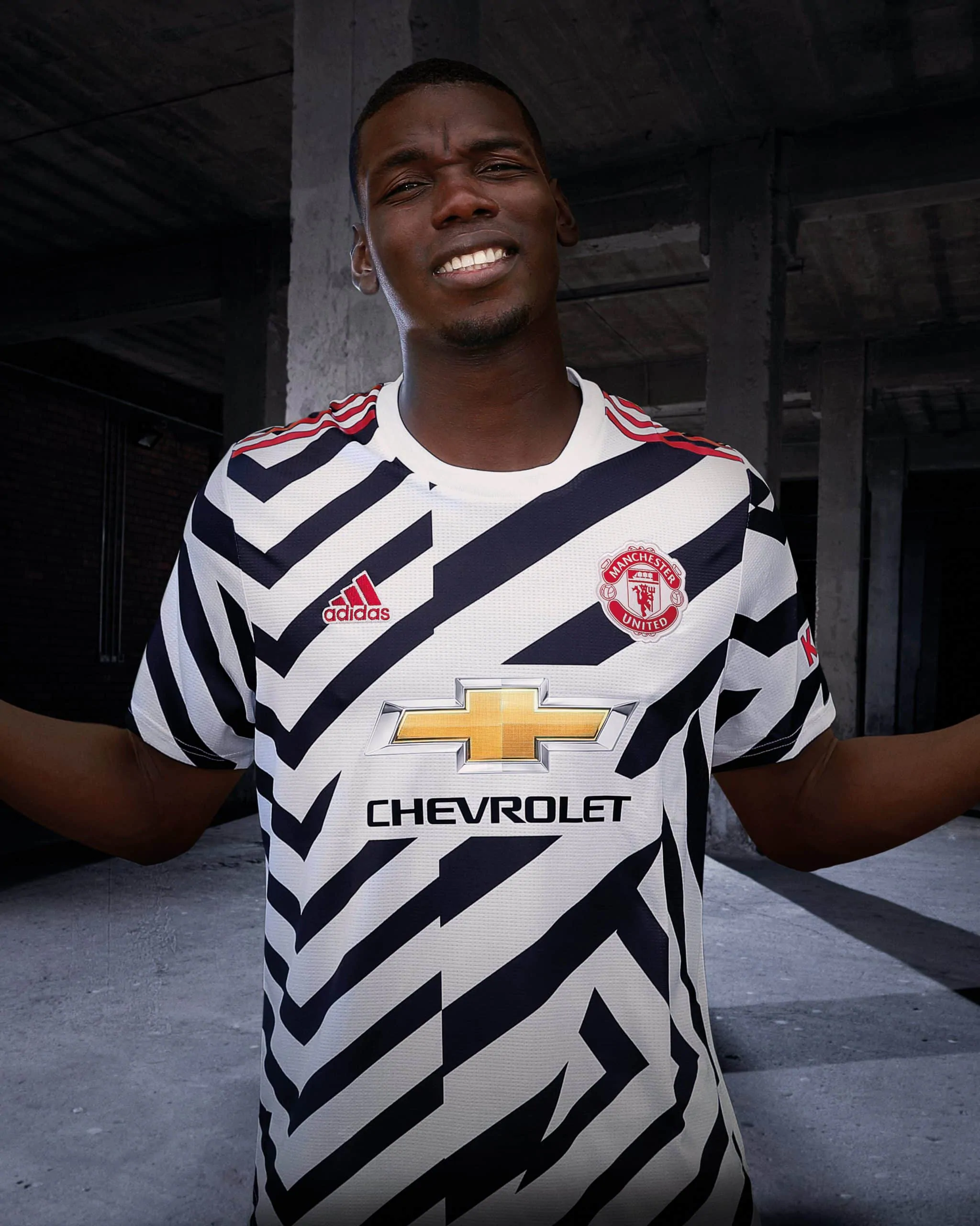
Manchester United 2020 Third Kit
The alternate kit features a camo print all across the shirt, socks and the shorts.
Adidas have introduced the ‘noisy’ design in black and white, also branded as the Zebra look. The logos and the stripes are done in red.
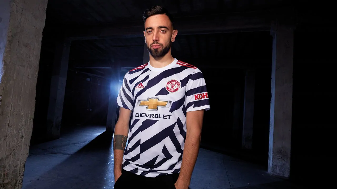
There is a message on the inside collar that reads ‘OT 110 – 110 years of stripes at Old Trafford’ and it celebrates the 110th anniversary of Old Trafford.
The shorts and socks are plain white.
How do you feel about this season’s Manchester United kits? Let us know on Twitter.
And remember to check out the rest of our 2020 Premier League kits.
Add Sportslens to your Google News Feed!